The trouble with experienced users is that they think they know everything. The problem is, they do! They might even know your product better than you do. But then that leads them to make assumptions that can trip them up when they encounter an unusual use case. So while it makes sense to focus on new users, keep in mind how use will change with experience.

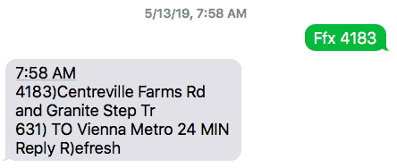
I am a case in point. My local transit system has a service where you can text them a stop ID and they will respond with the estimated arrival time of the next bus.

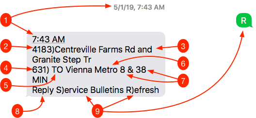
The reply is a straightforward recitation of information:
- The timestamp of the message
- Bus stop code
- Bus stop location
- Bus route code
- Final destination
- Estimated time until arrival at stop
- Further calls to actions
This is a lot of content packed into a small space, which is to be expected given the constraints of text messaging. This is useful for the first time user since it confirms known information, thus increasing the confidence that the important information, estimated arrival time, is correct. But herein lies the problem for the experienced user.
Tunnel Vision
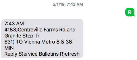
As an experienced user of this service, I use it multiple times every workday, perhaps up to 30 times a week. Because of this, I no longer read everything in the text. This is how I see it:

Because I do this so much, I don’t bother reading the whole message. Lack of reading is a common user behavior (How Users Read on the Web by Jakob Nielsen is still a good reference 20-plus years since it was written), but is especially so for repeat visitors.
My behavior, though, tripped me up recently. Dutifully waiting at my stop, the bus estimated to arrive within minutes, waiting, waiting … Wait! What? Where’d the bus go? When I complained to the bus service, I was informed that the message I received told me the bus wasn’t coming. I was skeptical.

Sure enough, if I responded with “S”, I would have been told that my bus isn’t coming. OK, would have been much better to just tell me that in the initial text, but I’ll give them the benefit of the doubt that that isn’t possible given their technology. Accepting that, though, this could have been designed better.
Ruthless Relevance
One of the key heuristics we apply at Ten Mile Square when reviewing user experience is the relevance of every single item displayed in a user interface. We break this down by relevant, relevant but redundant, or not relevant. We also have to apply a dimension that differentiates between first-time users vs. frequent users. With this approach, we see that:

| Field | Relevance | User Considerations | Verdict | |
| 1 | Timestamp | Redundant | The time of the message is needed in order to calculate the time of arrival. | Remove |
| 2 | Bus Stop Code | Redundant | You must enter this code in to initiate the text. You could make the case that repeating it here will ensure you entered the correct code; however, codes along a route are not sequential, so if you fat-fingered the entry, you’d either get an error in return or a result that is clearly incorrect. | Remove |
| 3 | Bus Stop Location | Redundant | Ditto #2, plus the content takes up a lot of space | Remove |
| 4 | Bus Route Code | Relevant | A bus stop may service multiple bus routes. The system won’t know which one the user is waiting for, so this is necessary | Keep |
| 5 | “TO” | Irrelevant | This will always prefix the destination, not the origination. | Remove |
| 6 | Final Destination | Relevant | There are some bus stops that serve both directions of a route, such as a park & ride. | Keep |
| 7 | Estimated Time until Arrival | Relevant | This is the most important piece of information. | Keep |
| 8 | “Reply” | Relevant | I’m split on this hard-coded text. You could make the case this is is required for the first-time user, but I’d like to conduct user tests to see if people see #9 as a call to action without being told it is. | Remove |
| 9 | Further Calls to Action | Relevant | Ugh, I don’t like this, but given the constraints of the medium, this may be necessary. I would set a high bar, though, on what would be listed. | Keep |
There’s only one item that’s irrelevant and it’s a small one. The real conundrum lies in what’s necessary for the new user vs. what gets in the way of repeated use.
Two Ways to Express a Future Time
A good design is one which minimizes the cognitive load; that is, a design that doesn’t offload mental processing to the user. Consider this use case:
- I enter the code for my bus stop.
- I receive a response telling me how long until the bus should show up.
- I wait a while.
- I look back at the text to remind myself when the bus should arrive.
There is nothing in the response message that will explicitly tell me WHEN the bus will arrive. I will either have to send R to get a new message or execute some math to add the Time Until Arrival value to the Timestamp. Granted, neither of these is a huge lift, but it could be avoided if the response included the actual time of arrival.
I would not recommend switching only to Time of Arrival, I think both that and Time Until Arrival is useful. If I send my text message while I’m at home, a large Time of Arrival value immediately tells me whether I have time enough to get a caffeinated beverage. In the previous use case, while waiting at the bus stop, the Arrival Time will tell me when, at this exact time, the bus will arrive.
White Space Is Your Friend
Clearly, your choices are limited when designing a text message interface. All you have to work with is text within what you have to assume is a very narrow window. It is very easy to wind up with an undifferentiated blob of text. There are two ways whitespace can help you:
- Carriage Returns: OK, in normal circumstances, a carriage return is a piece of content, so it shouldn’t be used for display purposes. (You are using the padding-bottom property, aren’t you?) In this case, though, since you don’t have access to CSS, it’s OK to use carriage returns to add some whitespace to set off important blocks of content.
- Hyphens and Similar Punctuation: Within a block of text, if you need to set something off, you might resort to spaces. However, you cannot assume extra space characters won’t be stripped, so consider using hyphens or other similar characters. The objective is to provide enough whitespace so that the content you want to bring attention to stands out.
The Forgotten Interface
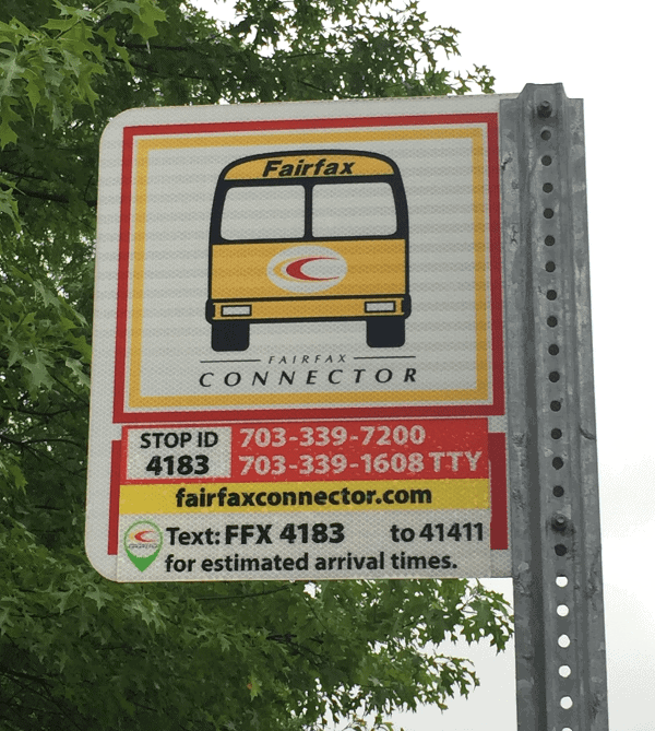
One bit that people may leave out is the signage at each bus stop.

We could off load information from the response text to this display. Anything that won’t change for this particular stop could be displayed here, saving us space in the response text.
Recommended Design
So, given these considerations, what is my recommended design for these text messages? Let me start with the ideal.

This has everything the user would need: the bus in question, time until arrival, and the arrival time. This assumes, however, that you can tell the user the real time, and it leaves out the Refresh call to action.
I’m inclined to leave out the Refresh. I do not believe that its value is greater than the cost of cluttering up the interface. Combined with the likely necessity of including a Service Bulletins call to action, that Refresh makes it more likely to trip up the user by masking the Service Bulletin.
Given the necessity for a Service Bulletin call to action when there’s an issue with the bus, this is what I suggest:

The user will be used to a single line response (which is a good reason to try to keep the destination text as minimal as possible). The presence of more than one line will cue the user to an unusual circumstance. The whitespace between the response and the call to action will make both easier to consume.
Remember, the objective of this is to let the user know when the bus is going to arrive. Anything beyond that is superfluous and, if you really need it displayed, put it on the sign at the bus stop.